I won’t be at the meeting tomorrow — I’m out of town, on vacation — so Carol asked me to post about how I chose my colors for Sudoku.
When I choose colors for a design, I frequently start with some color inspiration along with the actual materials list for the piece which I think of as a model, leaving out the colors but taking note of the values (dark vs. light). I also noticed that Marilyn Owen’s colors were complementary, or opposite each other on the color wheel — pink and green. After some thought I discarded that as a plan, though, and decided to stick with my own color inspiration.
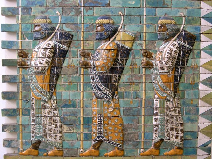
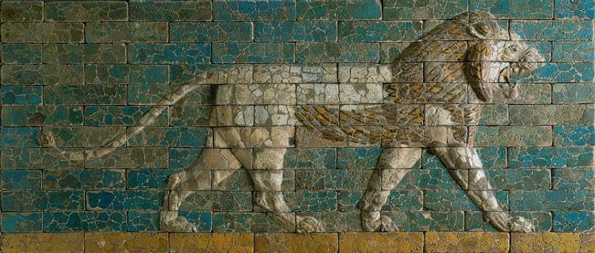
For Sudoku my inspiration came from some Persian relief sculptures I saw many years ago at an exhibit at the Metropolitan Museum of Art. The colors have always stuck with me, and in fact I have to resist the urge to do EVERYTHING in these colors! Here are a couple of images I found on the Internet — not the same pieces I saw at the Met, but similar. The colors are somewhat darker than what I have in my mind’s eye, but you get the idea.
With my inspiration images in mind, I studies the materials list in Needle Pointers: two shades each of two colors, one shade of a third color that might be a neutral, a metallic, and a variegated thread. The samples shown in the article don’t stick to this precisely, though. It obviously makes it harder if you don’t have a specific model to follow (too many choices!), so I decided to try and follow the materials list model. But if the threads I found led me in a different direction, that would probably be OK as well.
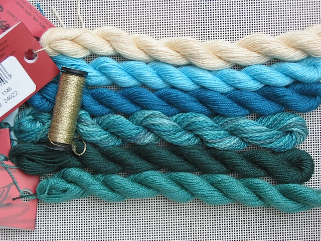
In the end I managed to stick to the materials list model — two shades of turquoise Impressions, two shades of green Impressions, cream Impressions, and Watercolors “South Pacific.” I chose a gold metallic braid to go with it — I toyed with silver, which frequently looks good paired with turquoise, but decided that the gold gave it all a richer look.
(For some reason the greens look right in this photo but the turquoises do not — they are too blue and not greeny enough.)
Even though I won’t be at the meeting, I’ll be stitching along with you tomorrow night, and will post a photo of my progress. You can never be entirely certain that your color choices are going to be successful — or look like what you expect — until you see them stitched.

Love your choices of colors, but am most impressed with your thought process going into the initial selections.
Sue
Love your colors and your commentary. However, the overdye used in the original was a stranded cotton, using only 1 strand for stitching on 18 count. It is only used in the borders, so you could wait and start the squares before needing it. You may find the Watercolours much too heavy, and want to switch to Waterlilies (assuming the colors, which will be similar but different from the Watercolours, still go with your solids).
Marilyn Owen
Yes, you are absolutely right! I was so focused on color that I overlooked the weight of the thread… I’ve used the Watercolors on the outside only, which creates a very different look than your original…for the over-one innermost dividers I’m using a single strand of Silk ‘N Colors silk floss. I haven’t decided what to do for the borders of the nine sections. I have a Waterlilies 12-ply silk in the same colorway as the Watercolors, but it is kind of grayed down and I’m not sure that I like it. Given the weight of the outer border, I don’t think I want the inner borders to be light and delicate, so I may use two ply of one of either the Silk ‘N Colors or the Waterlilies.
I’m pretty happy with how this is coming out, though! I’ll post a photo of my progress…